


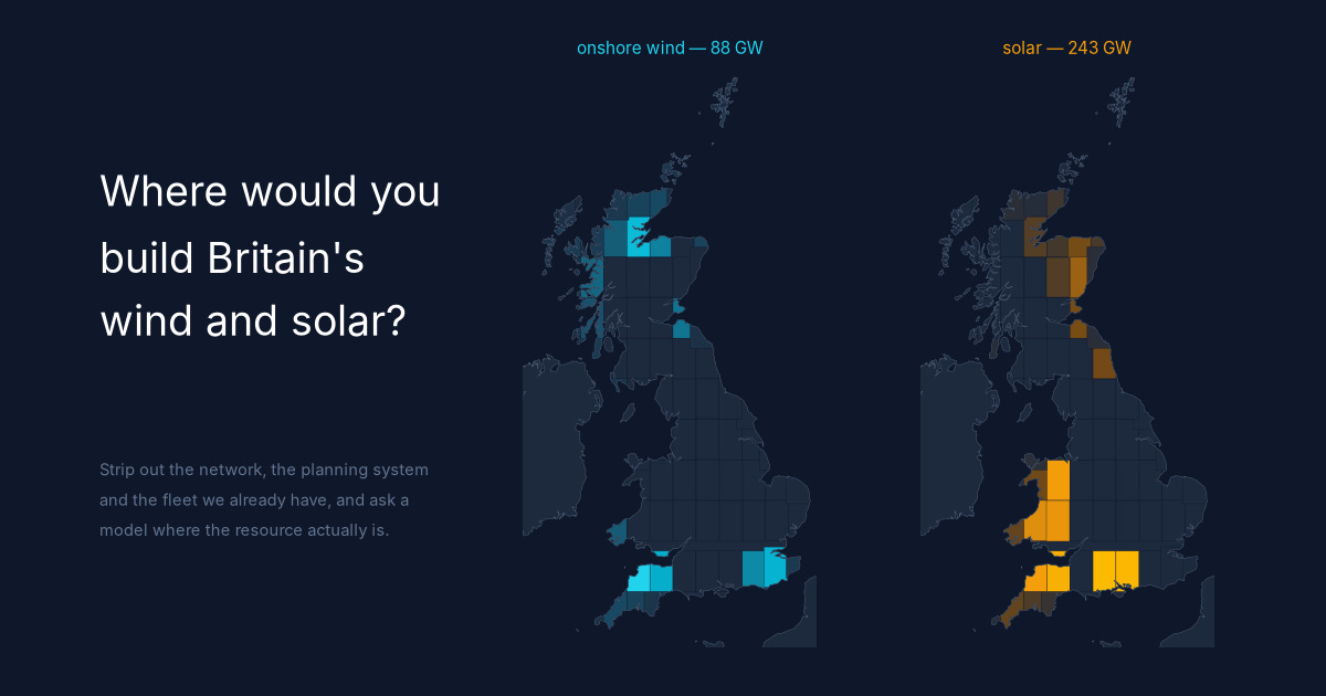
Last week I wrote about learning PyPSA, the open-source power system model, and used it to rerun a single day of Britain's gas fleet. That is the easy rung of the ladder: the plants exist, and you ask which of them runs.
This is the rung above. Stop telling the model what exists. Give it the cost of a turbine, the cost of a panel, the cost of a battery, a couple of years of real weather, and a map of what land can be built on — then ask it what it would build, and where.
I did not choose the fleet below. The model did.
The dial nobody expects
Start with the cost, because it reframes the whole argument.
I gave the model a dial. At one end it could burn as much gas as it liked; at the other, none at all. The surprise was the first end.
Offer it gas for 40% of demand and it takes 9%. Offer it 12% and it builds exactly the same fleet — same wind, same solar, same batteries, to the decimal. It does not want more gas at any allowance. Left alone, with no climate policy, no target and no carbon price beyond the one the market already charges, it builds a system that is 91% renewable, because that is simply what costs least.
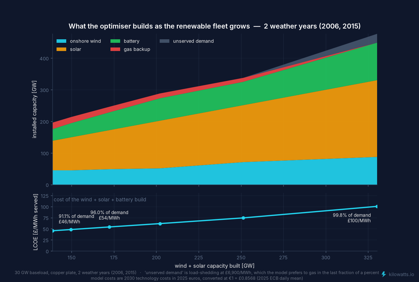
That system — 45 GW of wind, 93 GW of solar, 37 GW of batteries — costs £46/MWh. Push to the far end of the dial, where no gas is allowed at all, and the same model builds 88 GW of wind, 243 GW of solar and 119 GW of batteries, throws away 54% of everything it generates, and the cost goes to £100/MWh.
So Britain is not really arguing about the 91%. It is arguing about the last 9%, and that is where all the money is. Anyone who tells you renewables are cheap is describing the left-hand end of that dial. Anyone who tells you they are ruinous is describing the right-hand end. Both are reading the same curve.
The assumptions, plainly
Everything above rests on what things are assumed to cost, so here they are in full. These are the PyPSA technology-data figures for 2030, in 2025 euros, converted at €1 = £0.8568 (the 2025 average):
Onshore wind: £1,185 per kW, 30-year life, operating costs 1.22% of capital a year. Output is derated 15% for wake losses and availability, and limited to 3 MW per km² of eligible land.
Solar: £413 per kW, 40-year life, operating costs 2.48% a year, 5.1 MW per km².
Batteries: £129 per kWh, four hours of storage, 15-year life.
A discount rate of 7% real, which is what turns those capital costs into an annual cost. It matters more than any other number here: at 7%, wind's capital costs about £95 per kW a year; at 10% it would be nearer £120, and every conclusion about how much to build would shift.
Backup gas: £137/MWh to run, plus £113,000 per MW a year to build and own. The running cost is today's gas (£66/MWh, National Gas, mid-September) and today's UK carbon (about £73 a tonne) through a 58%-efficient plant. The fixed cost is a new combined-cycle station from the same technology-data set: £950 per kW over 25 years at 7%, plus fixed operating costs.
The cost line on the chart covers wind, solar and batteries only — not the backup plant, and not a single pylon.
That last one I got wrong the first time, and it changed the answer. My original run priced backup at £103/MWh to run and £34,000 per MW a year — which is roughly what it costs to keep an existing gas station available, not what it costs to build one. Meanwhile wind, solar and batteries were all being charged full construction cost. Gas was competing on a subsidy of my own making.
So I repriced it and solved the whole thing again. Charge gas honestly and:
the unforced system goes from 84% to 91% renewable;
solar at that point rises from 58 to 93 GW, and batteries from 13 to 37 GW — storage, not wind, is what cheap gas had been crowding out;
the cost of that system rises from £38 to £46/MWh, because it is a bigger build;
and the far end of the dial does not move at all, because when no gas is allowed the price of gas is irrelevant.
The direction is worth sitting with. Making gas more expensive did not make the renewable system look worse. It made the model want more renewables and more storage, sooner — and it shrank the disputed slice from 16% of demand to 9%.
Then look at where it puts them
Here is the part I did not expect.
Britain's power stations were built in the middle. The population-weighted centre of electricity demand sits at 52.67°N, in the East Midlands, about 30 km from Ratcliffe-on-Soar. The Trent and Aire valley fleet — Ratcliffe, Cottam, West Burton, Drax, Ferrybridge, the stretch once nicknamed Megawatt Valley — grew up almost exactly there.
That was not luck, and it was not only about demand. Three things happened to coincide on that ground: the Nottinghamshire, Derbyshire and Yorkshire coalfields were underneath it, the Trent and the Aire could supply cooling water, and the centre of the country's demand was a short wire away. Site the stations on the coal, cool them in the river, and you are already where the load is.
And where the coal ran out, you could still bring more in, by rail or by sea. That is the property that mattered: coal goes where you want it.
The model's fleet sits an average of 429 km from that centre.
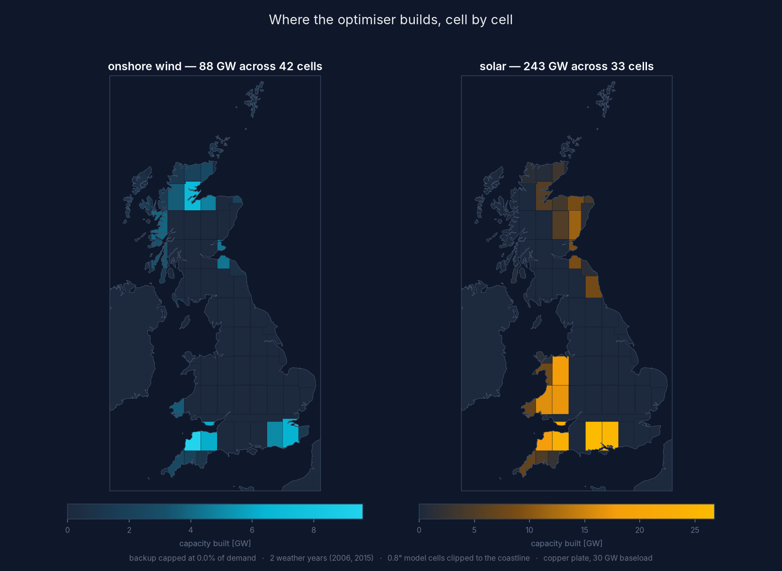
Look at what it does with the Trent and Aire valleys. Those seven grid cells contain 44 GW of land eligible for wind and 127 GW eligible for solar. The model builds nothing there. Not one megawatt. The ground that hosted Britain's electricity industry for a century is, on resource grounds, the last place you would put its replacement.
Instead every gigawatt of onshore wind lands within 35 km of the sea.
That is not the constraint it sounds like: two-thirds of Britain's land is within 35 km of the coast, so there was plenty of inland room. The model simply did not want it. Wind's average load factor falls from 42% within 15 km of the sea to 30% further inland, and no amount of cheap land makes up for it. It took 42% of the coastal land available to it and left the interior alone.
Two different edges, usually confused
There are two separate things going on, and they get conflated in every conversation I have about this.
The coast is about resource. Sea breezes, no hills and no towns to slow the wind down. That shows up 35 km inland, on land, with no marine technology involved at all. When people say the sea is Britain's energy frontier they normally mean tidal or wave. It isn't. The sea's value is what it does to ordinary onshore wind.
North and south is about timing. The build is barbell-shaped: the middle band, 52–56°N, uses 5.4% of its eligible land, while the far ends use 88%. That is not because Caithness and Cornwall have better wind than Yorkshire. It is because they have different wind. Output at two sites decorrelates with the distance between them, and Britain is about 1,000 km long and 400 km wide, so long separations only exist on one axis.
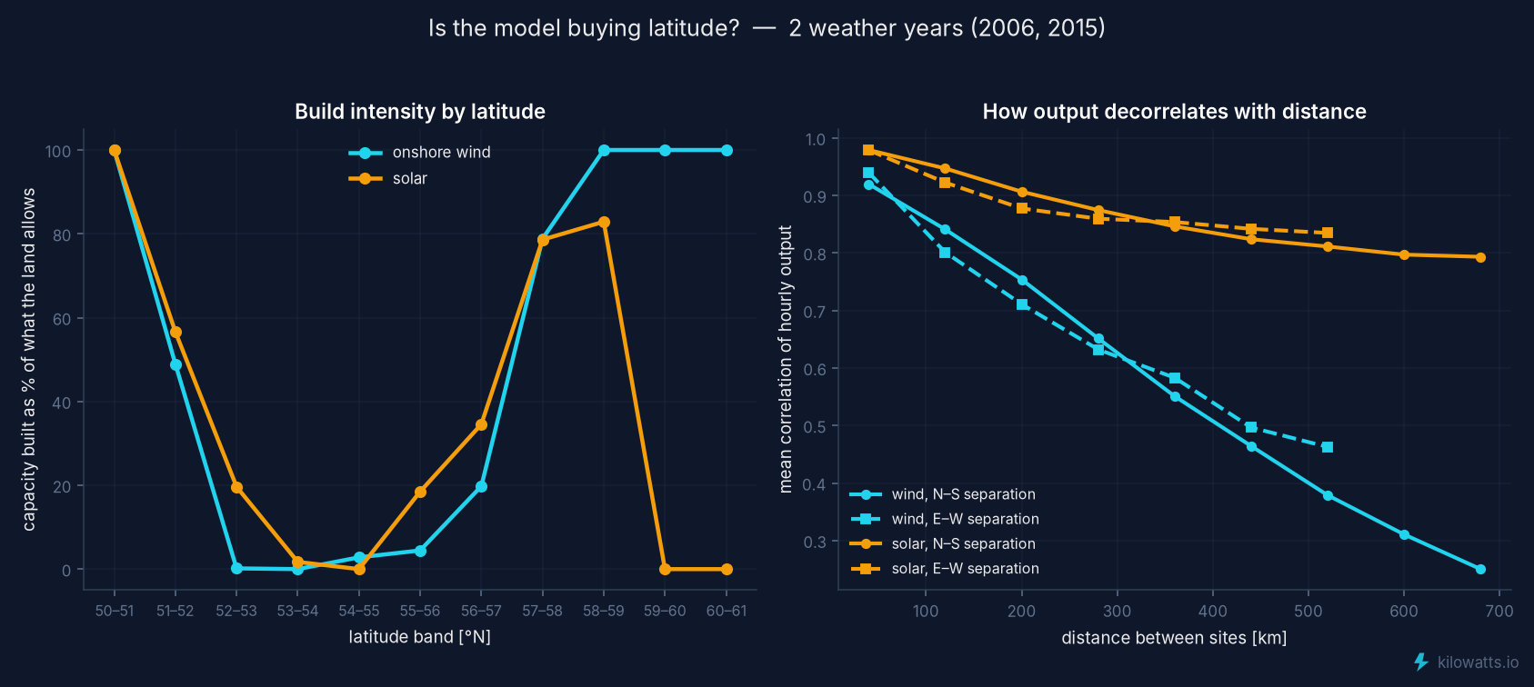
The model pays for that timing in yield. Its first tranche of wind averages a 44.5% load factor and its last 30.5% — and the sites it never touches average 37.6%. It passes over good wind to buy worse wind that blows at a different time. Solar does the opposite: it takes the sunniest land first and works down, because solar output across Britain is nearly perfectly correlated. You cannot buy timing from the sun here. You can only buy quantity.
What this is, and what it isn't
This is a deliberately narrow model, and the simplifications are the point: they are what isolate the geography.
There is no network. Modellers call this a copper plate: one bus, no wires, no transmission cost, so moving a gigawatt from Caithness to Kent is free and instant. A wireless grid. It is a physical absurdity, and it is exactly what makes the experiment worth running — everything the map shows is resource, and nothing in it is network. No planning system, so England's onshore wind history doesn't exist. No existing fleet and no interconnectors. Demand is a flat 30 GW, which flatters solar against a country that peaks on winter evenings. Offshore wind isn't modelled at all. Nuclear isn't either — though it's worth saying that almost every nuclear station Britain ever built is also coastal, for cooling water. The move to the coast did not start with wind.
And it is solved on two weather years, 2006 and 2015, the worst and best wind years in the record — a compromise forced by the memory on my laptop.
That last one matters enough to test. I froze the fleet the model chose and re-ran it against all twenty years, 2005 to 2024. It needs unabated backup for 0.13% of demand on average, and never more than 0.46% in the worst year. Three years it needs none at all. A fleet designed against two years of weather holds up across twenty.
The honest bit about cost
I don't want to bury the number that cuts against the enthusiasm.
Going from 91% renewable to 99.8% takes the cost from £46 to £100/MWh. It needs 119 GW of batteries — three times the storage of the 91% system — and 243 GW of solar against 93. It throws away more than half of everything it generates. Intermittency is genuinely, painfully expensive at the last stretch.
But notice what that number contains: it is the whole cost of intermittency, on the wireless grid, with no wires at all. Every argument Britain is currently having on top of that — constraint payments when Scottish wind is turned off, the cost of new transmission, network charges — is the cost of the network and the planning system, not of the weather.
The public debate collapses the two. When wind is paid to stop because the wires are full, that gets reported as renewables being unreliable. The power existed, at the right moment. The wire could not carry it.
The thing I keep coming back to
Here is the sharpest way I can put what this model taught me.
The distinction that matters is not firm versus intermittent. It is transportable versus in-situ.
Coal, gas, oil, uranium and biomass are transportable. You move the fuel to wherever you want the power station, which means generation can be sited for the convenience of everything else — the network, the cooling water, the demand. Wind and sunlight are in-situ. The energy is where it is. You can move the electricity afterwards, but only by building a wire, and only at a cost.
That single property explains the whole map. And it explains three acts of British history:
Demand went to the fuel. The industrial cities grew on the coalfields, because in 1800 that was the only way to use coal.
Then generation went to the coal, the water and the demand at once. In the Trent and Aire valleys those three things sat on the same ground, and the stations followed — and when a pit closed, the trains kept the stations running anyway. Megawatt Valley, about 30 km from the demand centroid.
Now generation has to go to the resource, and nothing else can follow. The wind is 429 km from that centroid. Demand cannot move: cities are two centuries of sunk capital. Generation cannot move: the resource is fixed.
The wire is the only degree of freedom left in the system. Which is exactly why it is the binding constraint, and why the argument about it is so bitter.
For two hundred years Britain enjoyed a co-location it never had to think about — first because demand chose the fuel, then because fuel could be carried to demand. That arrangement has quietly ended. The cost of ending it is showing up in constraint payments and network charges, and being reported as the cost of renewables.
None of this is a recommendation. Nobody is going to build 243 GW of solar on a wireless grid with no planning system. It is a benchmark: what the resource alone would choose, if nothing else were in the way.
And the joke in the phrase is the finding. A wireless grid is the only version of Britain in which the wind being 429 km from the demand costs nothing at all. Every pound of difference between that map and this country is the wire.
The interesting number is the gap between that map and the one we actually have. That gap is the price of the network and the planning system, stated in geography rather than in pounds.
Model: PyPSA, solved with HiGHS on a laptop. Weather from ERA5 via Open-Meteo; land eligibility via atlite; costs from the PyPSA technology-data 2030 set. Thanks to PyPSA Labs and the Supergen Energy Networks Hub, whose Birmingham course got me started.